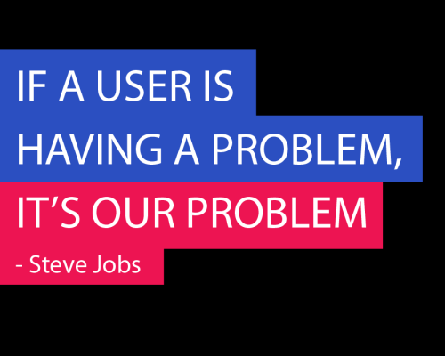
Stop punishing your users

if-a-user-has-a-problem

I'm gathering some ideas and notes for a presentation on responsive design and I really appreciated this from Brad Frost:

Follow this rule: Don’t penalize users for visiting your site on smaller device. It’s a myth (PDF) that mobile users don’t want/need certain information. Mobile users will do anything and everything a desktop user will do, provided it’s presented in a usable way.

Our students have told us for several years that they use their mobile device mainly for quick information – not for detailed searches. But I've really started to question that as my own web habits have changed over the years.

I'm constantly moving between devices during the day but unless I'm specifically working on a project at my desk, I'm most often browsing and reading information on my phone or tablet.

I'm not going to carry my laptop with me to the break room and I usually don't pull my laptop out much away from the unless I'm doing a lot typing (I'm typing this on my laptop). If I’m at home my laptop is most likely in my bag or docked in my docking station on my desk.

But you can bet I have my phone with me 95-percent of the time and I'll pull it out constantly to view information relevant to what I'm doing.

So while I can look at our stats and see our bounce rates for screens with smaller resolutions remains high in comparison to larger resolutions, I've questioned if it's really the users' preferences or issue with our site.

What say you?

Do you use your phone, tablet or a laptop/desktop most when you're away from your desk?
Trying some new theming

I’m playing with a few different site designs behind the scenes.

(Love me some WAMP server BTW).

I think I’ll keep things fairly basic and flat like the last few design iterations but I’m not sold on a color scheme yet.

What do you think?

Shake and Bake t-shirts

Shake and Bake T-Shirt

When I was in college my roommate and I started a simple t-shirt company – Refugee: Clothing Worth Talking About.

We ordered 10-15 shirts to start off with, but unfortunately they weren’t printed before the end of the semester (when I expected them) so we didn’t sell as many as we hoped.

This afternoon I got the itch to do a few more basic designs and decided to try them out on Spreadshirt.com to see how they do.

I’ll try and add more shirts as time goes by (maybe even bring back a couple of those original designs as well).

You can find them all at casadeblundell.spreadshirt.com.

As an added bonus if you order more than $50 from Spreadshirt.com you can use the code SHIPPEDFREE (for the US) and CADSHIPPEDFREE (for Canada) and get your shipping for free.

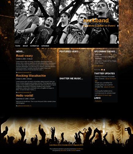
Working on a new WordPress theme

Wordpress theme - rockband orange - front page

Over the weekend I started working up some mock-ups (demos) for a new web design for some friends.

I don’t know that they’ll use what I originally came up with, but thought I’d keep working it and turn it into a full WordPress theme.

Right now I’m calling it Rockband, but I plan on changing the name to something a bit more clever before I release it into the wild.
Continue reading Working on a new WordPress theme