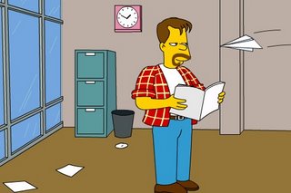
Get your mouse out and start clicking away to create your own Simpson character. I’m seeing a fun encounter animation/comic coming – sometime.
Category: design
Gimp vs. Photoshop

Blogger and commercial-prepress worker Philip McClure runs Photoshop by day and Gimp by night. Which is better? Read his comparison to find out.
McClure comes to the main conclusion that because of its press capabilities (specifically CMYK and Pantone modes) Photoshop is a must for any professional printers/designers.
But Gimp is the better choice for home users instead of pirating a copy of Photoshop.
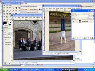
I’ve been using Gimp for my graphics program since my hard drive crashed in December and while it’s taken some getting used to I’ve enjoyed it. Yes, it’s not Photoshop which I have become extremely dependent upon over the years for countless applications and would love to be able to afford for my home computer – but I can still do good/decent work with it and its way better than Microsoft Paint.
Here’s a few banners I put together in a couple minutes with Gimp. I could have done more but I just needed a couple quickies to advertise OrangeNoiseRadio:

Via Lifehacker
The power of visuals
According to a multimedia prof in Florida (link redacted), a graphic presentation showing the Cowboy’s new stadium received 42,000 hits, compared to just 20,000 for the print version.
That’s a huge difference for just five pics.
How can we put that information into use in our churches?
I think it shows how visually stimulated our current society is.
If people can actually see what you’re trying to tell them there’s more chance they’ll pay attention and retain it.
Cowboys stadium preview
The cowboys have put together a computer generated tour of the their new stadium, set to open in Arlington in 2009. It may be the best computer generated stadium I’ve ever seen.
But there’s no audio until Jerry Jones makes comments near the end, so feel free to keep your computer cranked with OrangeNoiseRadio as you watch.
Make your own envelopes
Instead of buying envelopes for all those letters you send why not go the extra mile and make your own from magazines and card stock.
Not only will the receiver be surprised by the creative spark you have but you’ll also save some money and a few trees.
Via DIYHappy.com
Build your own photo booth
Seriously, everyone needs a photo booth and Instructables.com shows you just how to make one.
Maybe I should build one for my wedding reception. It would save on paying a photographer and everyone can take their photos home with them.
