It’s amazing how geared we are to visual cues these days and how powerful visualization can be in helping us understand and comprehend information.
A good infographic can go a long way in informing an audience and/or swaying them to your side – depending on how the data and information is presented.
I’ve been collecting infographics on Pinterest for a year or so now and it’s been fascinating to see how the graphics can be used to tell a story and how infographics are evolving.
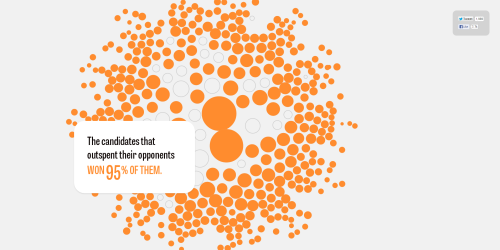
Just check out what letsfreecongress.org is doing with their interactive infographic/website. Not only is it responsive (looks great on mobile) but each section evolves and changes as you scroll down the page. And a number of areas display hidden information while you hover over them.
Co.Design also writes about how infographics are changing Congress:
Back in June, something amazing happened in Congress. During the annual long-term budget outlook hearing, Maryland Congressman Chris van Hollen raised a single piece of paper confidently in the air. He pointed at it, cited it, and used it as an anchor for discussion on the future of our economy.
This paper wasn’t a bill or even a full budget report. It was an infographic.
Today, it seems like much of that hearing was for naught; gridlock prevailed, and the sequester came to fruition. But that moment still represented a turning point in the way Congress understands the costs of public policy–all thanks to one go-getter in the Congressional Budget Office (CBO) who’s trying to visualize a more sensible future.
Pretty fascinating stuff.
