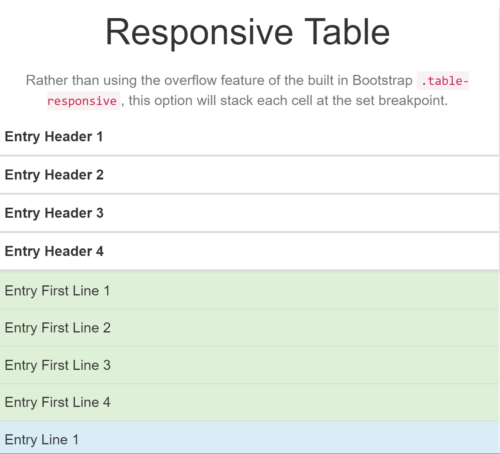
I’ve never been a big fan of HTML tables. They take forever to code, they tend to have accessibility issues and they’re typically horrible on smaller screens.
However, sometimes you just can’t get around them.
If you’re using Bootstrap, there’s a out-of-the box fix, using .table-responsive. This utilizes an overflow and lets the table scroll left to right on smaller screens … but … I’ve never been a fan.
It’s not the most user friendly option and if you try to print the table, it almost always gets cut off (since you can’t scroll on a piece of paper).
There are javascript options as well … but … I’ve never been a fan of those either. I always prefer to keep things simple with HTML and CSS if possible.
So I’ve put together a basic option that uses a simple CSS solution, with:100% and display:block.

You can set it up with a single media query or I’ve modeled my solution to match the Bootstrap breakpoints.
So for each breakpoint here’s the code for screens below 575px wide:
@media screen and (max-width: 575px) {

.table-xs-responsive th, .table-xs-responsive td {

width: 100% !important;

display: block !important;

box-sizing:border-box;

}

}
Note: I include border-box on the CMS I’m working with as it defaults to box-sizing: content-box
See the Pen Responsive Table (with Bootstrap) by Jonathan Blundell (@jdblundell) on CodePen.
Of course the one downside to this solution is the table headers don’t follow the content as you scroll on your mobile device but for most of our tables that’s typically not an issue.
What do you think? Have you found a better solution for responsive tables?